Connecting Figma via MCP: Surprisingly Usable Metadata, Missing the Component Library's Finer Details
2026-06-02
The design file has everything it should have, but...
Same as last time — this Figma design file has everything it should have, but for machines (and for whoever has to clean it up), that structure causes seriously distorted code output. After hitting a wall with the REST API — unable to get an agent to read the design file automatically — I gave Figma MCP a try.
First, connect to the file via Figma MCP and pick 1–2 core components (e.g. a primary button), then see how clean the metadata is without cleaning up the Figma file first. This experiment tells you directly whether cleanup is needed and how much. If the result is surprisingly usable, the whole cleanup phase can be skipped; if it's a disaster, only then decide the scope.
Step 1 | Pick a component
Pick the most core, most frequently used component in the Figma file — usually the primary button (it touches five token categories: color, typography, spacing, radius, and state). Just one — don't spread thin.
Step 2 | Pull metadata via Figma MCP
Use Agent + Figma Dev Mode MCP to read that component directly, then dump the raw data. You'll see three things:
- What the raw metadata looks like (layer names, styles, variables)
- What Figma has already normalized within its own capability (e.g. whether variables are used)
- What still needs to be cleaned on the code side
Step 3 | Decide the cleanup scope
Once you've seen the real data, come back and judge: is it "messy but the metadata is usable enough to extract directly," or "even MCP can't read anything decent — at minimum these components need fixing"? This call can't be made by guessing — only the data can tell you.
To run this experiment, you need two things:
- A link to the component in Figma (select it → right-click → Copy link to selection; or the whole file URL with a node-id appended)
- Confirmation that Figma Dev Mode MCP is enabled
Setting up the Figma MCP server
Official docs:
Before starting, confirm:
-
The Figma desktop app is installed and running
-
The design file must be in Dev Mode — check the team plan first
- Confirm the team hosting the source file is not on the free (Starter) plan
- Figma's Dev Mode (and Dev Mode MCP) requires Professional or above
-
Enable the Dev Mode MCP server
This setting is surprisingly hard to find — thankfully there's a search function
- Click the grape-like Figma icon in the top left, search
Devin Actions - Switch to Dev Mode
- Click the grape-like Figma icon in the top left, search
Connecting the MCP server to an agent
Codex can't connect via CLI — it needs the app. To get connected quickly, I switched back to Claude Code.
1. Install the plugin
- In the terminal, run:
claude plugin add figma@claude-plugins-official - Press Enter to start the install.
- If Claude Code is running, restart it.
- Type
/pluginand press Enter to open the plugin marketplace. - Use the arrow keys to navigate to the Installed tab.
- Navigate to the
figmaserver, press Enter to open the authorization page, then Enter again to start authentication — an external page will open. - Click "Allow access" to finish authenticating and let Claude Code access your Figma account. Once done, return to the terminal and type
/pluginagain.
2. Add the MCP
- In the terminal, run:
claude mcp add --transport http figma-desktop http://127.0.0.1:3845/mcp - Restart, then type
/mcpto confirm the connection
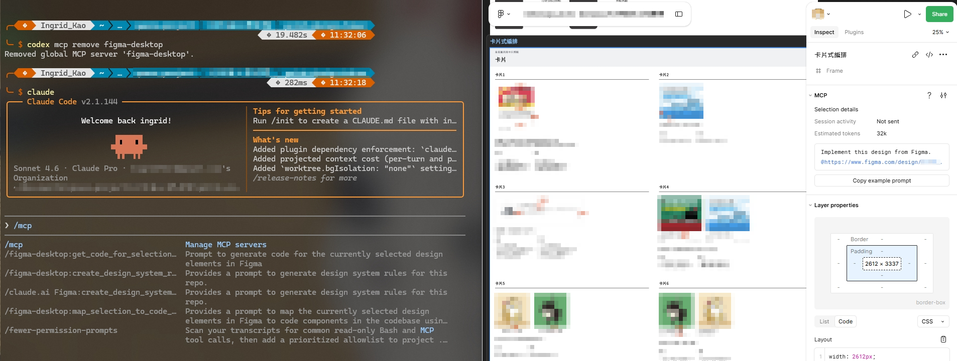
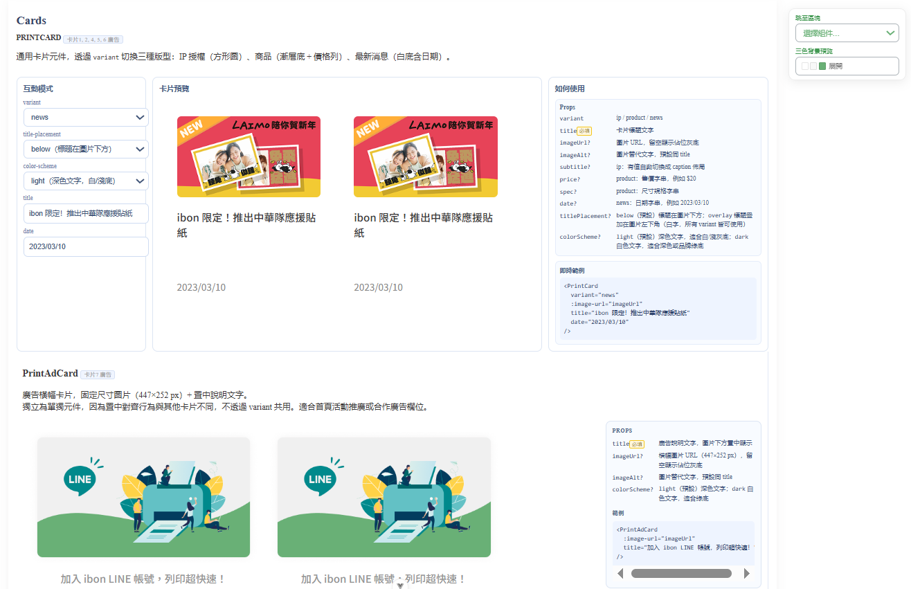
What the pulled data looked like
This time I selected a card and ran /mcp__figma-desktop__get_code_for_selection.
It took almost an hour but only burned 7% of the token budget — surprisingly cheap, and the result was even more surprising.
What came back wasn't just the card's raw metadata — the agent organized it straight into my codebase. Plenty was still missing, but it was a huge improvement over the REST API.

From there I started shaping it into the component library I actually wanted, prioritizing:
- Rule-driven: adjustable purely through props
- variant
- size
- hover and disabled states
- everything else (block layout, optional icon)
- Previewable: verifiable in interactive mode, rendered against three main background colors
- Reusable: clear usage pattern
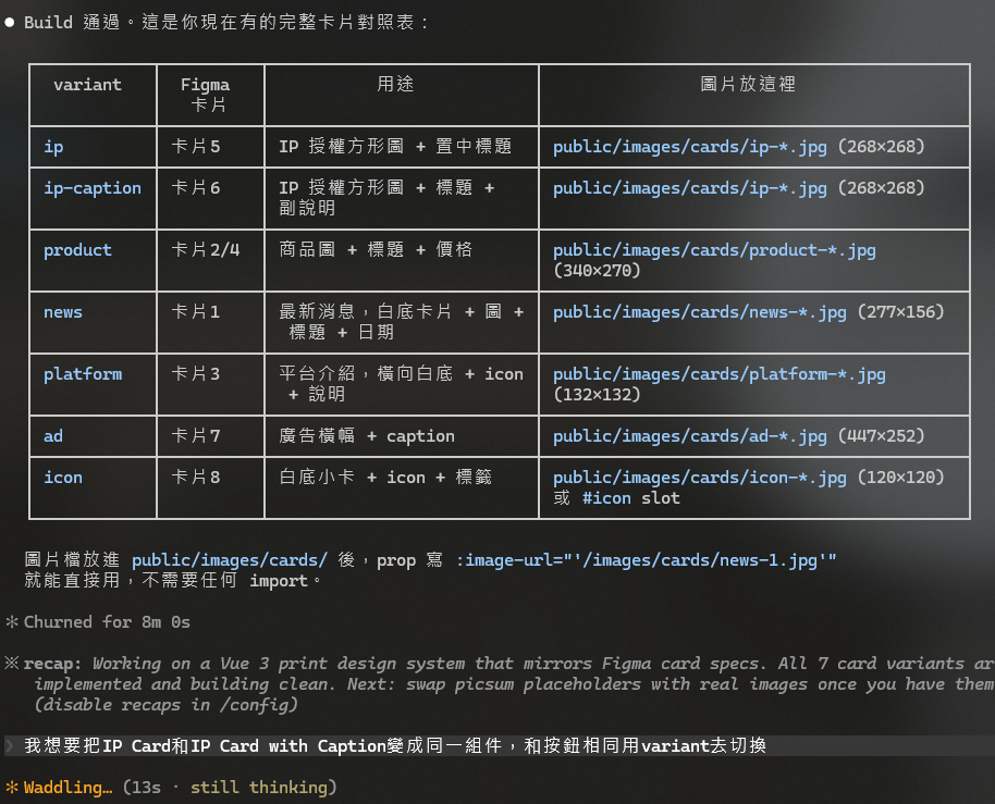
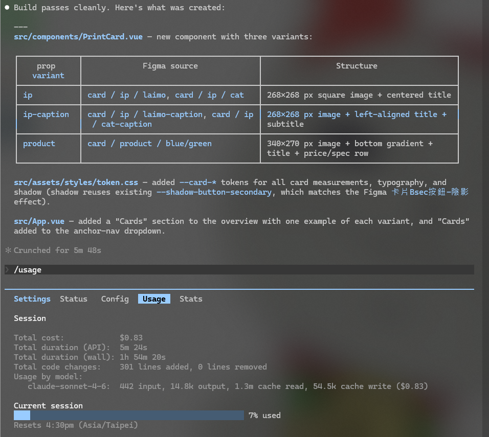
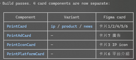
But this round was still missing the component library shape I actually wanted — cards 1, 2, 4, card 7, cards 5, 6, and card 3 should each collapse into one shared component, ending up as four variants total.
As of June 2026, agents are still very much the new hire who's great at looking productive on the surface. But thinking it through, it always comes down to a communication problem — turns out whether it's a human or an AI, you still have to actually spell things out 😃
After two hours of adjustments, it finally turned into what I wanted.
At this stage I made the following changes:
- Added a Figma → code workflow
- Converted plain CSS into a SCSS architecture
- Added a style-checking workflow — now just run
/check-styleto trigger it - Added version control:
git init
Next I want to verify whether the packaged components actually hold up (and are pleasant to use) in a real production environment — that's what the next post will cover.